Goal
Measure and understand the performance of Infiniband under load.
Parameters of the experiments
- Read operations performed by clients. Single table/object is read
over and over. - Cluster used - cluster hardware info is at Cluster+Configuration
rc02 - server (master)
rc03 - client (queen)
rc04-31 - client (worker) - multiple if required. - Call strack in code being measured
Bar.java
InfRcTransport<Infiniband>::ServerRpc::sendReply()
        InfRcTransport<Infiniband>::getTransmitBuffer()
                infiniband->pollCompletionQueue(commonTxCq,
                                                MAX_TX_QUEUE_DEPTH,
                                                retArray);
Results/Graphs
Reference Graph - Throughput of the system for 100 byte object
reads using different Transmit Buffer Pool sizes
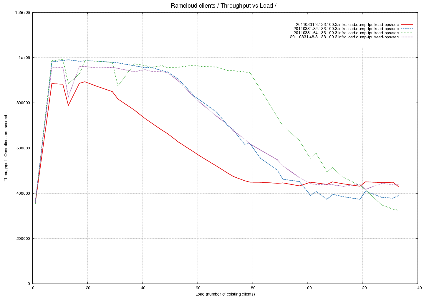
Analysis of throughput curves.
- Summary - throughput drops to 50% under high load.
- The throughput of the system is measured here against increasing
load. The load is in terms of read operations on 100 byte objects. - We notice that the throughput of the system drops by a factor of 2
for high loads. This is observed even though we are nowhere near the
network limits at this point. The measured outgoing throughput is
390217 ops/sec or 39M bytes/sec or 310M bits/sec which is well under
the expected 32Gbps limit. - The red, blue and green lines were measured with 24 RX buffers and
8, 32 and 64 TX buffers respectively. - The violet line was measured with 48 RX buffers and 8 TX
buffers. Notice that adding buffers to the pool on the receive side
allows the trasmit side to see a higher throughput - I do not
understand the reasons for this. - A set of further measurements are taken during the same experiment
and plotted on different graphs to aid understanding.
Latency Graph - Time spent in pollCQ per read (average) across
different Transmit Buffer Pool sizes
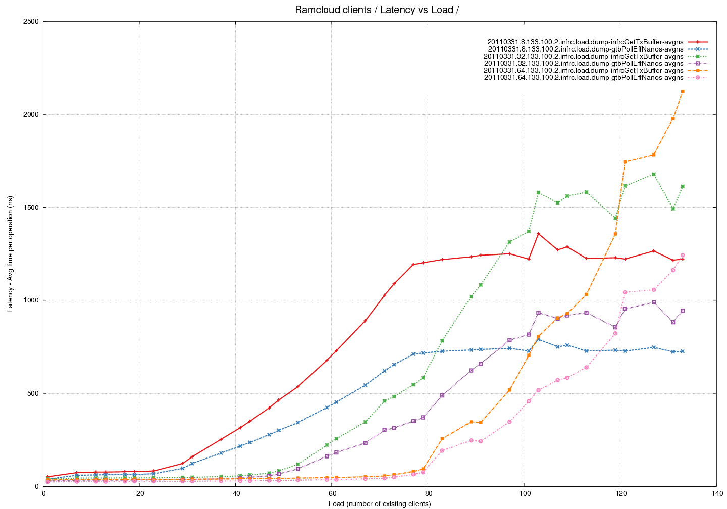
Analysis
- Summary - pollCompletionQueue() (and hence getTransmitBuffer()) take
longer to run with increasing load. Note that pollCompletionQueue()
would be called multiple times until a succesful return - an empty
buffer from the pool. - Red/Blue lines represent 24 RX buffers and 8 TX buffers
- Green/Violet lines represent 24 RX buffers and 32 TX buffers
- Orange/Pink lines represent 24 RX buffers and 64 TX buffers
- This a plot of measurements of time taken by the different functions
during the experiments. - Total time spent in pollCQ was tracked and then divided by the
number of read calls to calculate the average. - This tracks the curve of time spent within the getTransmitBuffer
call well. The difference between the two needs to be explained.
Latency Graph - Time spent in pollCQ per read (average) - fixed
pool of buffers - comparing time taken by successful calls against
calls that return 0
Analysis
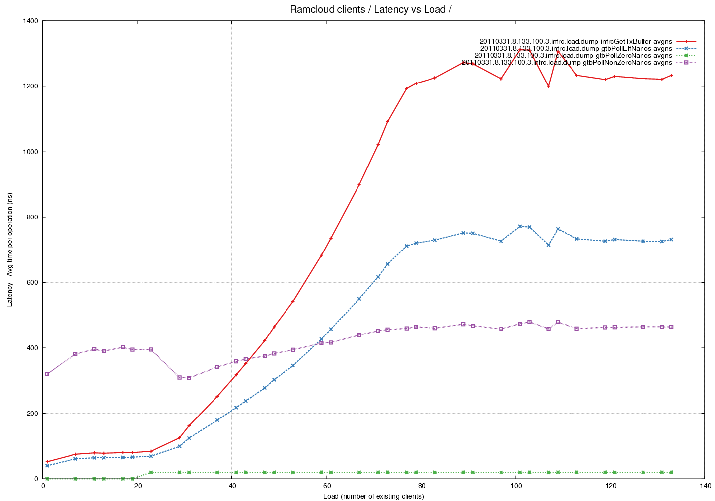
- This is the same latency curve as above restricted to the case where
the size of the buffer pool for TX buffers is 8. - The Red line represents avg time taken by the getTransmitBuffer() call.
- The Blue line represents avg time taken across all the calls to
pollCompletionQueue() - The Green line represents the average time taken by calls to
pollCompletionQueue() calls that returned zero empty buffers. - The Violet line represents the average time taken by calls to
pollCompletionQueue() calls that returned non-zero empty buffers. - Note that time taken per successful call increased slightly with
load. Number of calls however increased with load resulting in overall
time taken by getTransmitBuffer() increasing.
Latency Graph - Average number of buffers returned by pollCQ
across different Buffer Pool sizes
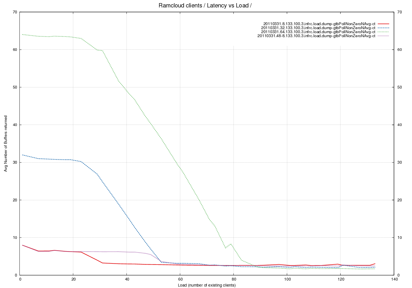
Analysis
- The red, blue and green lines were measured with 24 RX buffers and
8, 32 and 64 TX buffers respectively. - The violet line was measured with 48 RX buffers and 8 TX buffers.
- An interesting trend that appears to be independent of number of
buffers in the pool. There is a drop in the average at the same load
irrespective of buffer-pool. - Why does doubling the number of receive buffers affect the number of
empty transmit buffers returned ? Compare Red against Violet.